Why I built a mood diary with seven answers
Every mood tracker I've tried has failed the same way. Not at launch — three weeks in, when it stopped being a novelty and started being a chore. The apps all want too much: a journaling prompt, a slider from 1 to 10, a follow-up question about why. Answering properly takes two minutes, and two minutes is enough to skip a day, and a skipped day is how tracking dies.
So I built Mottled around one design constraint: the daily question must be too small to refuse. You open it, tap one of seven colours, and you're done. There is a notes field, and it's optional to the point of being hidden. No prompts. No score. No guilt mechanics begging you to protect a streak.
Colour instead of numbers
The obvious lazy version of "low friction" is a 1–10 scale, and I rejected it deliberately. A number invites arithmetic — is today a 6 or a 7? Yesterday was a 6 and today is worse, so… — and suddenly you're doing the analysis the app was supposed to spare you. Numbers also imply a single axis, and moods aren't on one: tired isn't a lower score than anxious, it's a different thing.
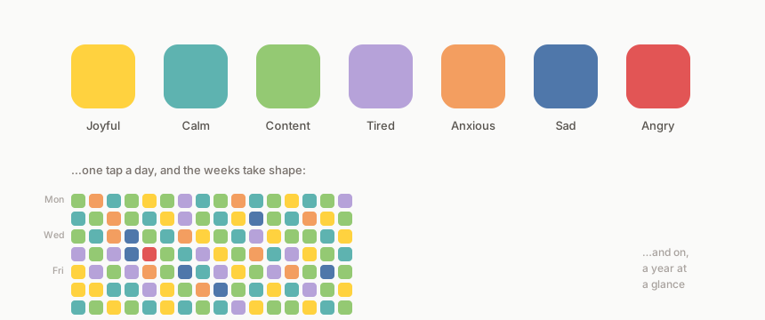
Mottled's vocabulary is seven named colours:
| Mood | Colour |
|---|---|
| Joyful | Warm yellow |
| Calm | Sea teal |
| Content | Soft green |
| Tired | Dusty lavender |
| Anxious | Pale orange |
| Sad | Slate blue |
| Angry | Signal red |
Seven is deliberate too. Enough resolution for real patterns, few enough that choosing takes a second. In the code it's a single string-backed enum — adding a mood is one new case with a label and a hex, no migration — but the product decision was the hard part, not the implementation. Every mood I didn't add keeps the choice fast.
The bet underneath all this: a low-resolution measure you actually take every day beats a rich one you abandon in March. One honest tap outperforms an abandoned essay.
The design decisions that mattered
One entry per day, and the day wins. The schema enforces a unique (user, date) pair and submissions upsert. Change your mind at 9pm and the evening's tap simply replaces the morning's. There is no history-of-edits, because the point is the day's colour, not an audit trail of your indecision.
Guests first, account later. You can use Mottled without signing up at all — entries live in localStorage on that device. If you eventually want sync or backup, you sign in and the local entries migrate to the server. Most habit apps demand the account before they've demonstrated any value; I wanted the order reversed.
No passwords. Sign-in is a magic link — a signed URL emailed to you, thirty-minute expiry, user record auto-created on first use. Identity is just an email address. Phone, desktop and tablet each get their own session against the same account, so multi-device works without any pairing ceremony.
The nudge is opt-in and local. An optional daily push reminder (self-hosted Web Push, no third-party service) fires at a time you choose in your timezone — the users table stores the reminder time alongside an IANA timezone id, because "8pm" means nothing on a server running UTC.
Timezones got me anyway, of course. The weekly heatmap had an off-by-one in its day-of-week grid for anyone east of UTC — Monday's entries rendering on Tuesday for half the planet — which is the kind of bug you only find when someone who isn't in Britain uses the thing. It's fixed, and it earned a regression test.
What the colours actually show
The pay-off isn't the daily tap, it's the heatmap. Week, month and year views, each day a small square of its colour. Even a month in, patterns I'd never have articulated are already visible: the anxious oranges clustering before certain commitments, tired lavender rounding off the busy weeks. The year view is mostly bare paper for now — it's the one I'm most curious about, because a rough week and a rough season look identical from inside them, and the grid will eventually know the difference.
The newest layer takes that further. Mottled now captures daily weather for your location from Open-Meteo (a genuinely lovely free API), correlates it against your mood history, and overlays weather glyphs on the heatmap. A small language model turns the correlations into a short plain-English narrative rather than a statistics table — "your calmest days lately have been the cold, clear ones" is more use to a human than a coefficient. Whether the correlations are causal is beside the point; they're conversation starters with yourself.
None of this is a business. It's a Laravel app with Tailwind and Alpine, a handful of tables, and a queue for the push notifications — deliberately boring technology, because the product's entire personality lives in what it refuses to ask of you. I built it because I wanted it to exist and nobody had made it quite this small.
A month in, the heatmap is already mottled — the name turned out to be the spec — and the diary has outlived the three-week mark where every richer tracker lost me. Smallness was the feature.